5 things to consider when styling a family room extension from our Andersons of Inverurie team
Kerry from our interior design team has worked on many interior projects over the years, helping clients achieve their desired style in their home. After gradually renovating her own home over the past 10 years, Kerry recently got to work turning her home extension into a stylish open-plan family area.
To give you a few tips for planning your new space and interior style, Kerry has shared the 5 main things she considered when styling her family room extension...

1. Plan your space
The first and most important step is to plan your space and consider how you want to use it. Any style can be applied to your interiors, but the layout and set-up of the space is individual to every room, so it's important to see what you're working with before you start filling the room with furniture and accessories.
My main goal for this space was to create a dining and family area which flowed from the existing kitchen and overlooked our garden. I started with a scale floor plan so I could see light, TV and radiator positions, making sure I had good socket positions for table lamps and charging points next to the seating areas.
I then scaled out furniture requirements for the space, focusing on what I wanted to use the room for so that I could choose furniture that would fit in the space and serve that desired purpose.

2. Consider the flow and connectivity of the room
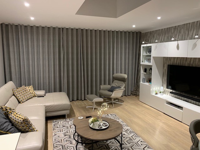
Once I've made a plan for the space, I then consider the style of interior that I want and how that will connect with surrounding areas in the home. For my home, I was keen to consider the look of my adjoining kitchen area so the new space flowed well from it. My aim was to create a light and airy, contemporary room with space for a sofa, TV and dining.
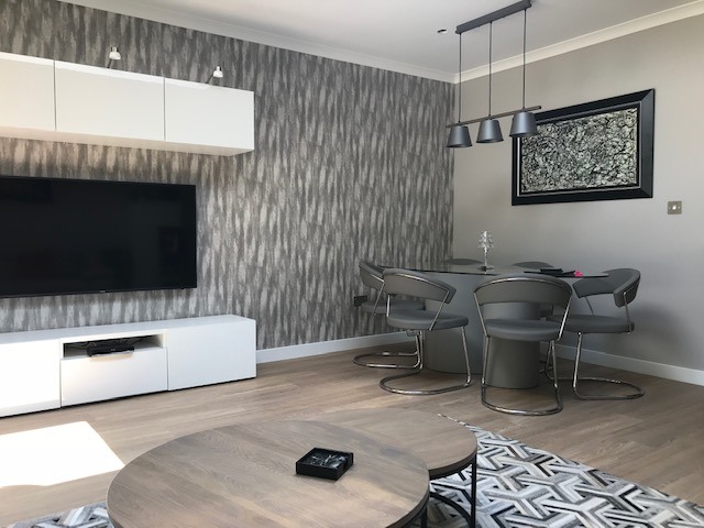
Open-plan spaces are very popular, but they can be hard to create a layout for as they are often large spaces with no internal walls, so you have to create 'zone' areas within the space. To overcome this, I focused my lounge area around a rug and TV unit, and I used a subtle feature wall to connect the dining area with the rest of the space.

3. Choose colours and textures
The best way to create a contemporary and minimal interior style is to add textures and select a good colour palette. My style for this room included a subtle colour palette, building soft changes of tone throughout the space.
For the paint, I chose Little Greene Paint in French grey; it's a lovely subtle grey but has a warm tone to it so it's great for creating a cosy atmosphere that's also stylish. French grey comes in a light, mid or dark tone, so I was able to use the different shades to add depth to the room and woodwork.
I also used similar tones in a subtle marble wallpaper on the wall behind the TV unit, to create a feature and bring some texture into the space. To keep the different spaces connected, I used the same paint colour in the kitchen and added a coordinating wallpaper to the breakfast bar area, which helped to 'join' the two areas together. Above the breakfast bar, I added a large copper edge clock, which works well with the wallpaper and adds a warm feel to the room.

4. Style the room with lighting, furnishings and flooring
Once you have your colour palette chosen and walls painted or wallpapered, you can add the furniture. I had to use most of my existing furniture but I added new Calligaris New York dining chairs and bar stools to the kitchen. I love the style of the New York chairs and the dark taupe colour was perfect for adding a darker shade to the furnishings and elevating the overall look.
The stylish Conform chair and stool in the lounge area is a great accent chair and very comfortable - it's the whole family's favourite chair in the house! We can swivel it round to face the TV, although usually it's facing the large patio doors out to the garden. I kept it in the same tone as the dining chairs to keep the spaces consistent, but I used a white frame and base to add a subtle contrast.
The window dressing was very important as we wanted to see the view to the garden, but be able to close the curtains and create a cosy atmosphere at night or on horrible days. For this, I chose a soft textured fabric of floor-to-ceiling curtains that complemented the rest of the interiors, and fitted a wave rail from wall to wall. These curtains stack back really well so they don't interrupt the view, but they also close easily when required - it's probably my favourite item in the space.
For flooring, I selected a Karndean Niveus oak wood floor that is fitted throughout the kitchen and extending into the family room to join these spaces together. I opted for a light tone to compliment my existing oak doors, plus I find that the light wood grain makes any space look larger and more open.
Lighting is an important feature for any space in the home to create a certain mood and style. I had large glass sliding doors installed to allow maximum natural light in and keep the room looking open and spacious. I also added lighting to the TV unit and a ceiling pendant above the dining table to create a striking feature, but also be able to have softer lighting in the evenings.

5. Have fun and add your own personality!
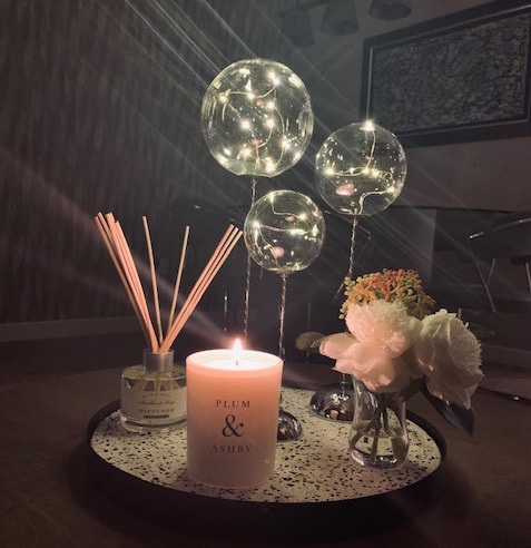
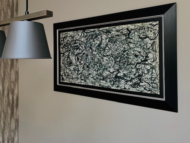
Finally, you can add the finishing touches and accessories, which is a great opportunity to bring your personality into the space. Things such as artwork or personal items you have collected throughout the years are great additions to personalise your space and express your style.
For my home, I selected a marble silk effect rug to add interest and texture, as well as scatter cushions that bring a pop of colour and pattern for a bit of fun! Scatter cushions are great to go bold with, as you can easily change them when you want to refresh your interiors.
Feeling inspired to style an area in your home? Get in touch with our interiors team

Be inspired by our latest products and projects, and get helpful tips for styling your home
FOLLOW US ON INSTAGRAMNewsletter
Stay up to date with our latest offers and news by joining our mailing list
Blog posts
Our New Cookware Department
Delivery Service Update
Adverse weather is affecting deliveries throughout the UK, in this post we answer some common questions that we have been receiving to assist customer queries.


